June 19, 2026
How to Choose a Wildlife Painting for Your Living Room: A Practical Guide
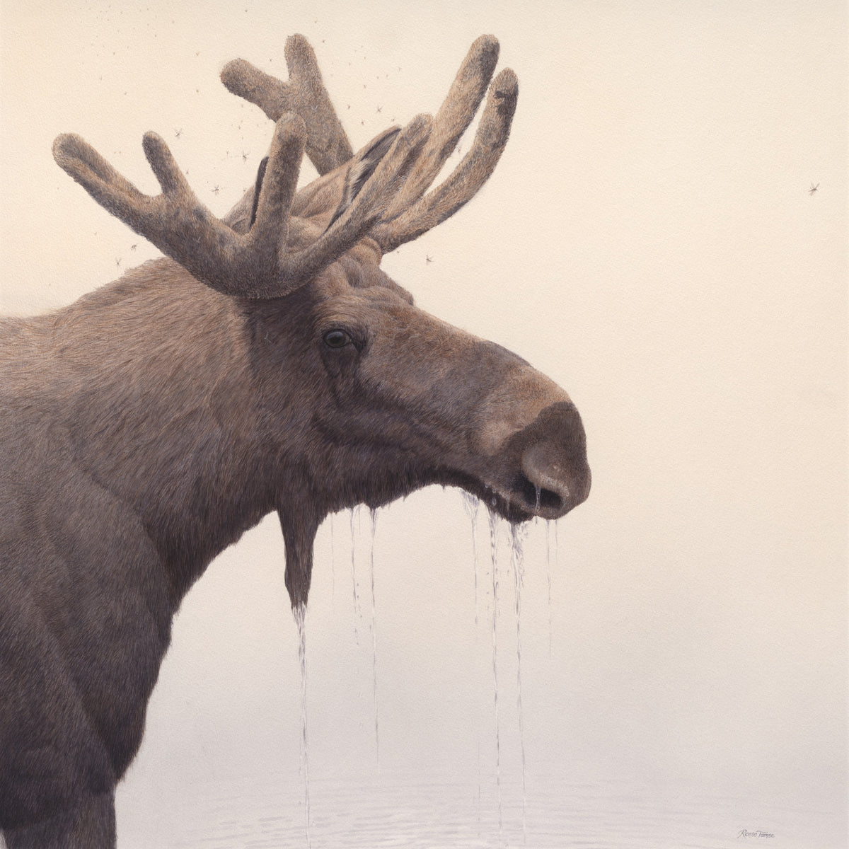
Most living rooms have one wall that wants a painting on it. The problem is that the painting most people end up buying is not the one their wall actually needs. They pick something they love in the gallery, hang it on the wall they had in mind, and live with a quiet sense that the room is fighting itself for the next ten years.
This is not a taste problem. It is a fit problem. A wildlife painting that hangs beautifully in your living room satisfies six specific conditions: it suits the wall, the light, the room's emotional register, the color palette, the format, and the room's purpose. If any one of those is wrong, the painting reads as decoration. If all six align, it reads as art.
This guide walks through each in order. It is written for collectors choosing a single statement piece for a living room — not for filling a gallery wall with assorted prints. By the end you should be able to walk into your own living room, look at the wall, and know what you are looking for.
Start with the wall, not the painting
The single most common mistake in choosing wildlife art for a living room is starting with the painting rather than the wall. You see something you love online, you order it, and then you spend an awkward weekend trying to find a wall that suits it. By that point, half the decisions are already made for you.
Walk into your living room. Find the wall you intend to hang the painting on. Measure three things:
- Wall width and height. The actual wall, not the room. If the wall is broken up by windows, doors, or furniture, the available rectangle is what matters.
- The height of the nearest piece of furniture. If the painting is going over a sofa or sideboard, you need the top of the furniture as a reference point. Bottom of painting should land roughly 15–25 cm above it.
- Natural light direction and intensity. Note where light enters the room and how it falls on the wall throughout the day. Direct sunlight on a print fades it; deep shadow makes it disappear into the wall.
Once you have those three numbers, the size of the painting becomes a constraint rather than a guess. A practical rule of thumb for art over a sofa or sideboard: the painting should be two-thirds to three-quarters the width of the furniture below it. Smaller, and it floats awkwardly. Larger, and it dominates the room before the painting itself has a chance to.
Pick the emotional register the room actually wants
The second thing to decide — before you even start looking at specific paintings — is what the room is for. A living room is rarely a single-use space. It might be where you read at the end of the day, where you host friends, where children play on weekends, where you watch films, where you have the difficult conversations. The painting on the wall is going to be in the room for all of those moments.
Some wildlife subjects work well for that. Others fight the room.
Paintings that work for living rooms:
- Animals at rest, looking sideways or downward, in calm landscapes
- Reflective compositions — birds near water, animals in mist or snow
- Predators in contemplative postures, not mid-hunt
- Single-animal portraits with soft eye contact
- Atmospheric weather — snow, dawn light, low fog
Paintings that fight a living room:
- Animals in active aggression — bared teeth, raised hackles, mid-strike
- Direct, locked eye contact at full intensity (better suited to a study or hallway, where you pass by rather than sit with)
- Action scenes with high visual drama (great in dining rooms or galleries, harder to relax with for ten hours a week)
- Very dark backgrounds that swallow the light in low-lit evening rooms
This is not about which paintings are better. It is about which paintings reward repeated long viewing. Living rooms get repeated long viewing. The work should reward it.

How to read a painting's proportions before you buy
Aspect ratio is the most under-discussed factor in choosing art for a room. A 3:2 landscape painting and a 4:5 portrait painting can be the exact same area in square centimetres and still read entirely differently on a wall.
A practical mapping for living rooms:
- Wide landscape format (e.g. 2:1, panoramic): made for above a sofa, console, or sideboard. Anchors a horizontal surface and visually extends the wall.
- Standard landscape (4:3 or 3:2): versatile. Works above furniture, between windows, or on an empty wall as a single statement piece.
- Square (1:1): excellent for narrow walls, between two doors, or as part of a balanced pair on either side of a fireplace.
- Vertical / portrait (2:3, 3:5): suited to narrow tall walls — between windows, beside a staircase, or in a corner where a horizontal painting would feel cramped.
- Triptych or paired works: statement-level decisions. A horizontal triptych over a sofa can be the room's defining feature, but it eats wall budget.
Before you commit, mock the painting up on the wall. Cut a sheet of newspaper or kraft paper to the exact dimensions of the print, tape it to the wall at the planned height, and live with it for 24 hours. You will know almost immediately whether the proportions are right.
Color palette: match, contrast, or anchor?
There are three valid strategies for the color relationship between a painting and the room.
Match. Pull a dominant or secondary color from the painting and echo it in cushions, throws, or a rug. This is the most forgiving strategy and reads as intentional design. It works particularly well when the painting has one strong accent color (e.g. the warm gold of a savanna scene, the deep blue of a winter wolf landscape).
Contrast. Choose a painting in a palette that deliberately differs from the room. A monochromatic grey-blue living room paired with a warm-toned tiger painting becomes a focal point precisely because the painting refuses to blend in. Risky in less confident interiors; striking when it lands.
Anchor. Treat the painting as the color anchor of the room — build the room around it. This is the move designers make for clients with a serious collection. The painting is bought first; the cushions come last.
Whichever you choose, avoid the trap of trying to color-match the painting to existing wall paint exactly. Art with no tonal tension against its surroundings disappears.
What works specifically in a living room context
To make this concrete, three examples from Renso Tamse's catalogue, each suited to a different living room mood:
If your living room is warm-toned (terracotta, ochre, brown leather, oak), look for paintings in warm dawn and savanna palettes — golden light, dust, mist. Lion, elephant and moose subjects work here. Mosquito Morning is a good example: a moose in golden dawn light, square format, the kind of warmth that doesn't fight a wood-and-leather room.
If your living room is cool-toned (greys, blues, white walls, modern furniture), wolves in winter and birds in snow are the natural fit. The cool palette holds together; the room reads as confident rather than cold. The Silence of Snow is an obvious candidate. So is most of the wolf and crane work.
If your living room is neutral (cream, taupe, dove grey — the most common palette), you have the most freedom. Single-animal portraits with strong eye-line work especially well, because the neutral palette doesn't compete with the subject. Swan Portrait and the lynx or fox portraits in the catalogue all sit well in this kind of room.

Frame or no frame?
The question is less about preference than about context.
Frame the print if:
- The room has other framed art already, and consistency matters
- The wall is busy and the frame helps the painting hold its visual ground
- The print is one of three or more pieces in a planned arrangement
- You want long-term preservation — a framed print under museum-grade glass is the gold standard for archival display
Float-mount or hang unframed if:
- The room is minimalist and a heavy frame would over-formalise it
- The print is meant to be the only piece on a feature wall
- You want the painting itself, not the framing, to be the visual event
A practical middle path: a thin matte black or warm oak floater frame, no mat board, painting filling the visible area. It reads as framed without imposing a heavy formal presence. This works in 80% of living rooms.
The size guide that actually works
Most online art shops give you sizes in pixels, inches, or centimetres without context. Here is what those numbers actually mean on a wall:
- Small (under 60 cm on long edge): not a statement piece. Works on a narrow wall, beside a bookcase, or as part of a multi-print arrangement. Standalone over a sofa, it looks lost.
- Medium (60–100 cm on long edge): the workhorse size. Suits most living room walls, sits well above furniture, doesn't dominate.
- Large (100–150 cm on long edge): statement piece. Designed to be the visual centre of the room. Needs at least three metres of wall to breathe.
- Oversized (150+ cm on long edge): gallery-level commitment. Works in open-plan living rooms with high ceilings; overwhelming in standard suburban interiors.
If you are not sure, go one size up rather than one size down. The single most common regret reported by collectors after their first purchase is that the print they chose was too small for the wall.
The five most common mistakes
- Hanging too high. The centre of the painting should sit at roughly 145–155 cm from the floor. Most people hang 10–20 cm too high.
- Choosing a print whose dominant color fights the sofa. If you have a strong-colored piece of furniture, the painting either matches it or contrasts cleanly with it. The wrong shade of "close to matching" is the worst outcome.
- Underestimating the impact of light. A south-facing wall in a sunlit room needs UV-protective glass or careful placement. A dim corner needs paintings with luminous lighter passages to read.
- Buying for the room you have, not the room you will have. Good art outlasts furniture. Buy work that you would still want if the sofa changed.
- Choosing the wrong tier. A signed and numbered Limited Edition over the sofa carries a different weight than an unsigned open edition. Both have their place; only one of them grows in significance over time.
A note from the studio
Most of Renso Tamse's wildlife paintings are available in three tiers (read how the editions work) and three proportional sizes per painting, so you can pick the right scale for your wall without compromising the painting's natural aspect ratio.
For a living room, the natural starting points are:
- The Open Edition Prints if you are new to collecting and want a museum-quality print without the commitment of a numbered edition.
- The Limited Edition Prints if you want a signed and numbered piece that will hold its value alongside its place on your wall.
- The Collector's Edition if the painting is the centrepiece of the room and you want the most exclusive tier available (25 prints worldwide per painting).
- A commissioned original if you have a specific animal, scene, or moment in mind that you want painted to your vision.
Every print ships flat, fully insured, with a Certificate of Authenticity for the signed tiers. Framing is left to you, with a guidance note in every order on how to specify the right framer if you don't already have one.
The short version
If you remember nothing else from this guide, remember this: measure the wall before you choose the painting, pick a subject that rewards long viewing, and go one size up. The rest is detail — important detail, but detail.
A wildlife painting in a living room is a long-form decision. The art will be there longer than the sofa, longer than the curtains, possibly longer than the room itself. Choosing it well is worth the extra hour of measurement and the extra weekend of looking.
Take the time. Trust the wall.