June 19, 2026
What Is a Giclée Print? A Buyer's Plain-English Guide
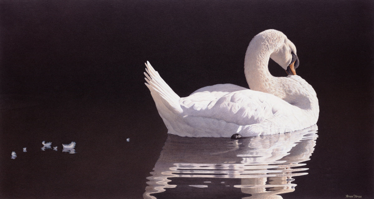
If you have ever shopped for fine art prints online, you have run into the word giclée. It appears in product descriptions, on certificates, in price justifications. It is treated as a quality marker. And yet, when most buyers are asked what it actually means, they pause.
This guide answers that question in plain English. By the end you will know what giclée is, what it isn't, how it differs from other print methods you might encounter, and how to tell a genuine archival giclée from a print that has borrowed the name for marketing.
The literal meaning (and where the name comes from)
The word giclée (pronounced zhee-CLAY) is borrowed from French. It comes from the verb gicler, meaning "to spray" or "to squirt." The term was coined in the late 1980s by Jack Duganne, a printmaker who wanted a more dignified name than "inkjet print" for the museum-quality work he and his collaborators were producing.
Which is, technically, what a giclée is: a high-resolution inkjet print produced on archival materials using pigment-based inks. The mechanism is the same one your office printer uses — millions of microscopic ink droplets sprayed onto paper. What separates a giclée from a standard inkjet is everything else: the resolution, the inks, the paper, the printer calibration, the color profiling, and the standards the studio holds itself to.
So the word is descriptive, not regulatory. There is no official body that certifies what is or is not a giclée. That is part of why the term is sometimes stretched. A buyer's job, then, is to look past the label and check the underlying specifications.
How giclée differs from other common print types
Giclée is one of several reproduction methods you will encounter when buying fine art. Here is how it compares to the alternatives.
Giclée vs offset lithograph
Offset lithography is the traditional commercial printing method used for books, magazines, and posters. It uses metal plates and oil-based inks pressed onto paper at high speed. Lithographs can be beautiful, but they have inherent limitations: a fixed color palette (typically four-color CMYK), visible halftone dot patterns under magnification, and ink that sits on the surface rather than penetrating the fibres of the paper. Most mass-produced "art prints" you find in poster shops are offset lithographs.
Giclée, by contrast, can use eight to twelve different ink colors, reaches far higher resolution, and produces continuous tone (no visible dots). The result is closer to the original painting in color fidelity and tonal range.
Giclée vs screen print (serigraph)
A screen print is a hand-pulled print made by pushing ink through a stencilled mesh — one screen per color, one pass at a time. Screen prints are themselves a collectible art form (think Andy Warhol). They have a distinctive layered look, often with deliberate misregistration as part of the aesthetic.
Screen prints are not better or worse than giclées — they are different products. Screen prints are typically used when an artist wants the print itself to be a worked artwork. Giclées are used when an artist wants the print to faithfully reproduce an existing original (a watercolor, oil painting, or drawing) at archival quality.
Giclée vs open edition poster
The cheapest end of the print market is the mass-produced poster: offset-printed on lightweight non-archival paper, no signature, no edition, no certificate. These are decorative objects that look great on day one and yellow on day five thousand.
The difference between a giclée and a poster is the difference between something built to last and something built to ship. A genuine archival giclée will look the same in fifty years as it does today. A poster typically will not survive ten.
Giclée vs canvas reproduction
You can produce a giclée on canvas as well as on paper. The substrate is different but the underlying process is the same: pigment inks, high resolution, archival materials. Canvas giclées are often stretched and gallery-wrapped, mimicking the appearance of an original oil painting.
Canvas works well for some subjects (action scenes, dramatic compositions) and less well for others (delicate watercolors, where the absorbent texture of paper is part of the painting's character). For wildlife art rooted in watercolor technique, paper giclées typically reproduce the original more faithfully than canvas.

What "archival quality" actually means
The phrase "archival quality" gets used loosely in art marketing. Used precisely, it means three specific things:
- Acid-free: the paper does not contain residual acids that would yellow or embrittle it over time
- Lignin-free: the paper does not contain wood pulp impurities that break down chemically in light
- Lightfast: the inks resist fading under typical display light conditions for a defined period — usually 100+ years
An "archival giclée" should meet all three. The independent body most commonly cited for lightfastness ratings is the Wilhelm Imaging Research institute, which tests ink/paper combinations under accelerated aging conditions and publishes years-to-noticeable-fade estimates. If a studio cites Wilhelm ratings, that is a strong quality signal.
The materials that make a giclée archival
The paper
Two paper families dominate fine-art giclée printing: 100% cotton rag and alpha-cellulose. Cotton rag is the traditional choice — the same family of papers used for watercolor originals and museum prints. Alpha-cellulose is a high-purity wood-derived alternative, slightly more cost-effective, used for many commercial archival applications.
For investment-tier work, look for 100% cotton rag at 300–315 gsm (grams per square metre). The most common premium brands are Hahnemühle (German), Canson Infinity (French), and Moab (American). Each has multiple specific papers with different surface finishes — matte, satin, smooth, textured. The choice of paper is part of the artist's decision and affects how the print looks under different lights.
The inks
The ink question reduces to one binary distinction: pigment-based or dye-based. Pigment inks suspend solid color particles in a carrier fluid; when the carrier evaporates, the pigment particles lock onto the paper fibres. Dye inks are fully soluble; the color molecules sit in the paper.
Pigment inks last. Dye inks fade. For archival fine-art printing, pigment is the only option that makes sense.
The current professional standards are Epson UltraChrome HDR / HDX, Canon LUCIA PRO, and HP Vivera — all pigment-based, all rated for 100+ years on archival paper. If a studio states the ink set, you can verify the rating in minutes. If a studio cannot or will not state the ink set, treat that as a yellow flag.
The process
A high-quality giclée is not just a print job. It is a color-managed workflow that starts with a calibrated capture of the original painting (usually a high-resolution photograph or a drum scan), continues through color profile creation specific to the chosen paper and ink set, and ends with a press-check where the artist or a master printmaker compares each printed test against the original in standardised light.
That last step matters more than most buyers realise. Two studios can use identical paper and identical inks and produce visibly different prints, because one studio has spent time matching the print to the original and the other has spent time pressing print.

Common myths and misunderstandings
"Giclée prints are basically just fancy inkjet prints." Technically true at the level of physics. Meaningfully misleading at the level of product. The difference between a $5 inkjet print and a $1,000 archival giclée is the same difference as between a $50 watch and a $50,000 watch — both tell time; one will be running in fifty years.
"Giclée prints fade quickly." This was true of early giclées from the 1990s, which used early-generation inks. Modern pigment inks on archival paper, displayed in normal indoor light conditions, are rated for 75 to 200+ years depending on the specific ink/paper combination. Display them away from direct sunlight and they outlast their owners.
"A giclée and a print are the same thing." All giclées are prints. Not all prints are giclées. "Print" is the category. "Giclée" is one specific method within it.
"If it says giclée, it must be archival." Unfortunately not. The word has no regulatory backing. Some studios use "giclée" for any inkjet print they produce, including non-archival ones. Always check the specifications.
How to tell a real archival giclée from a marketing giclée
Run these five questions past any product listing or studio. A real archival giclée will answer all five clearly.
- What paper is it printed on? Look for a specific named paper (e.g. "Hahnemühle Photo Rag 308gsm") and a weight in gsm. Vague answers like "premium fine art paper" are not enough.
- What ink set is used? Look for a named system (e.g. "Epson UltraChrome HDX pigment ink"). The ink determines lifespan.
- What is the rated lightfastness? Look for a number of years (e.g. "rated for 100+ years"), ideally citing Wilhelm Imaging Research or an equivalent independent source.
- Is the print signed and numbered? For Limited Editions and Collector's Editions, hand-signed and numbered by the artist is the standard. For Open Editions, signed but not numbered is acceptable.
- Does it ship with a Certificate of Authenticity? For numbered editions, yes. The COA should record edition size, edition number, paper, ink, and the artist's signature.
If a studio can answer all five without hesitation, you are looking at a genuine archival giclée. If two or more answers are evasive, you are looking at a print that has borrowed the term.
When does a giclée make sense, and when do you want the original?
Two simple decision rules:
Buy a giclée when you want the artist's work in your home at a sustainable price, when you value reproduction faithfulness, and when you would rather have a museum-quality print of a great painting than a poster of the same image. A signed Limited Edition giclée from a credible artist sits on your wall for a lifetime and quietly holds its value while it does.
Buy the original when the specific physical artefact matters — the actual brushstrokes, the actual paper, the actual signature in pencil at the edge of the watercolor. Originals are unique, irreplaceable, and priced accordingly. Most collectors build their collection around giclées and add originals as the budget and the relationship with the artist deepens.
A note from Renso Tamse's studio
Every print sold under the Renso Tamse Fine Art name is an archival giclée, produced to the following specifications:
- Paper: museum-quality 310gsm cotton rag, acid-free and lignin-free
- Inks: pigment-based, rated for 100+ years of archival permanence
- Process: color-managed workflow with press-checks against the original painting
- Authentication: signed Limited Edition (edition of 295) and Collector's Edition (edition of 25) prints ship with a numbered Certificate of Authenticity. Open Edition prints share the same paper and ink specifications, without numbering.
- Shipping: flat, fully insured, tracked worldwide
The full breakdown of edition tiers is on the How My Editions Work page. The collections themselves are organised by tier: Open Edition, Limited Edition, and Collector's Edition. If you have any specification questions before you buy, the contact page will reach Renso directly.
The short version
A giclée print, properly made, is the closest thing to owning the original painting at a price most collectors can manage. The technology is real, the materials are real, and the lifespan is genuinely archival — but only when the specifications are honest. Ask the five questions, check the answers, and you will know exactly what you are bringing home.